Earlier this year, the Atlassian Partner Scandio decided to split off their product department into a new company called “Lively Apps” (that’s us! 👋). As an Atlassian Solution Partner, Scandio was of course heavily utilizing the Atlassian stack internally, so there were several Atlassian Server systems that we had to take over from them. Here’s a short overview:
- A Jira Software instance for our internal development tickets
- A Bitbucket instance housing the source code of our apps
- An internal Confluence instance for us to collaborate in
- A public Jira Service Desk for providing support to our customers
- A public Confluence instance that provided the documentation of our apps
As we are a small team it was immediately clear to us that we wouldn’t want to maintain these Server installations and their underlying infrastructure going forward. We also didn’t want to maintain multiple deployments of Confluence and Jira simultaneously. So we quickly decided that we wanted to aggregate all of them into one single system by migrating to the Atlassian Cloud.
This mostly was a breeze for our internal Jira, Confluence, and Bitbucket instances. Also our public Jira Service Desk was easy to migrate to the Cloud and not only came with great visual improvements, but also with an amazing Slack integration which we grew to love and now heavily rely on. But there was one big problem:
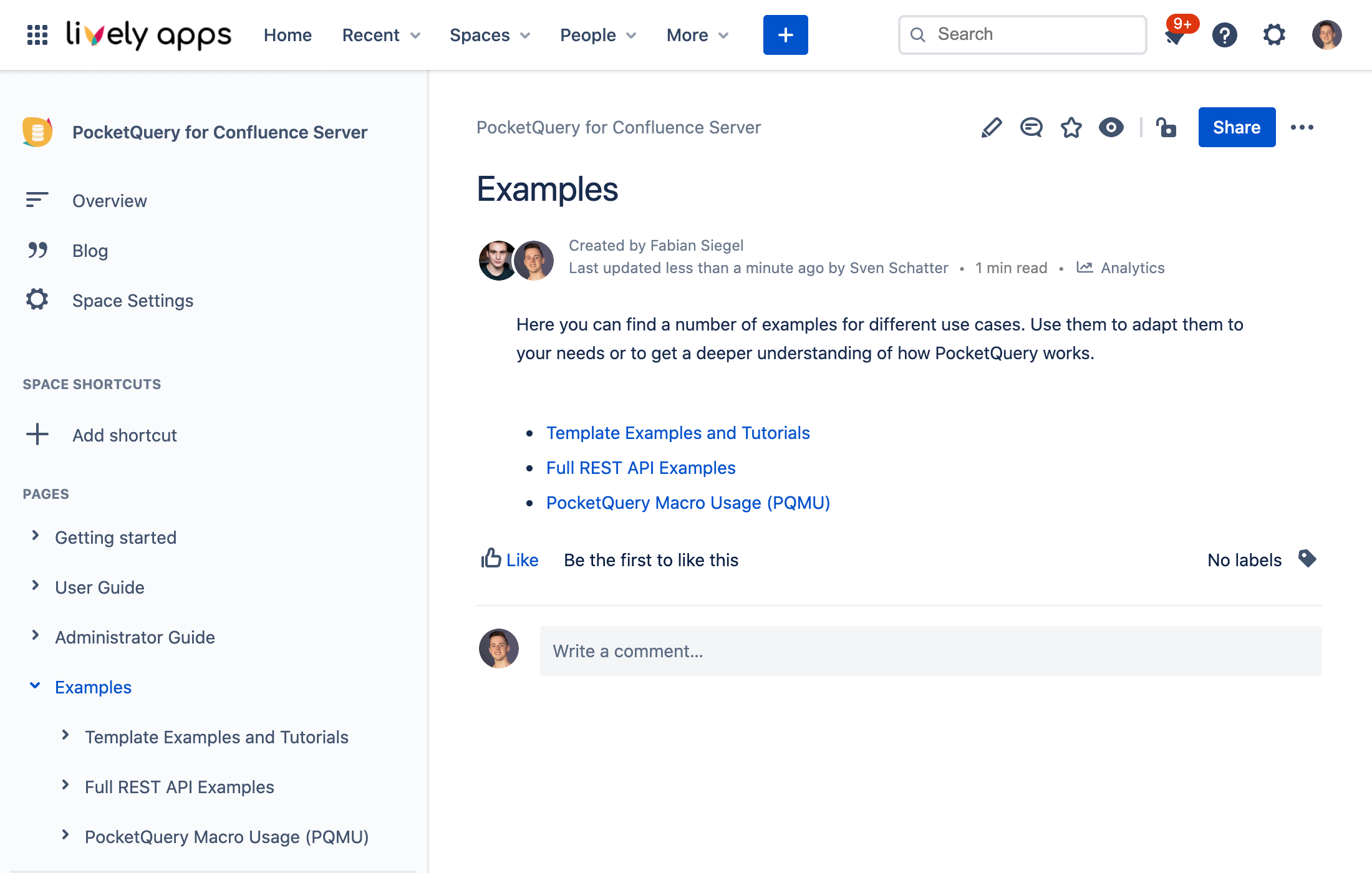
Of course, we were unhappy with what Confluence Cloud provided us in terms of creating a public documentation. On our Server version of Confluence, we had thoroughly customized the appearance and functionality of Confluence through our own apps. For example, using Lively Theme, we had adjusted the look and feel of Confluence and created a custom navigation. We had also used HideElements to hide unnecessary information from our Confluence pages such as attachments, likes, and comments.
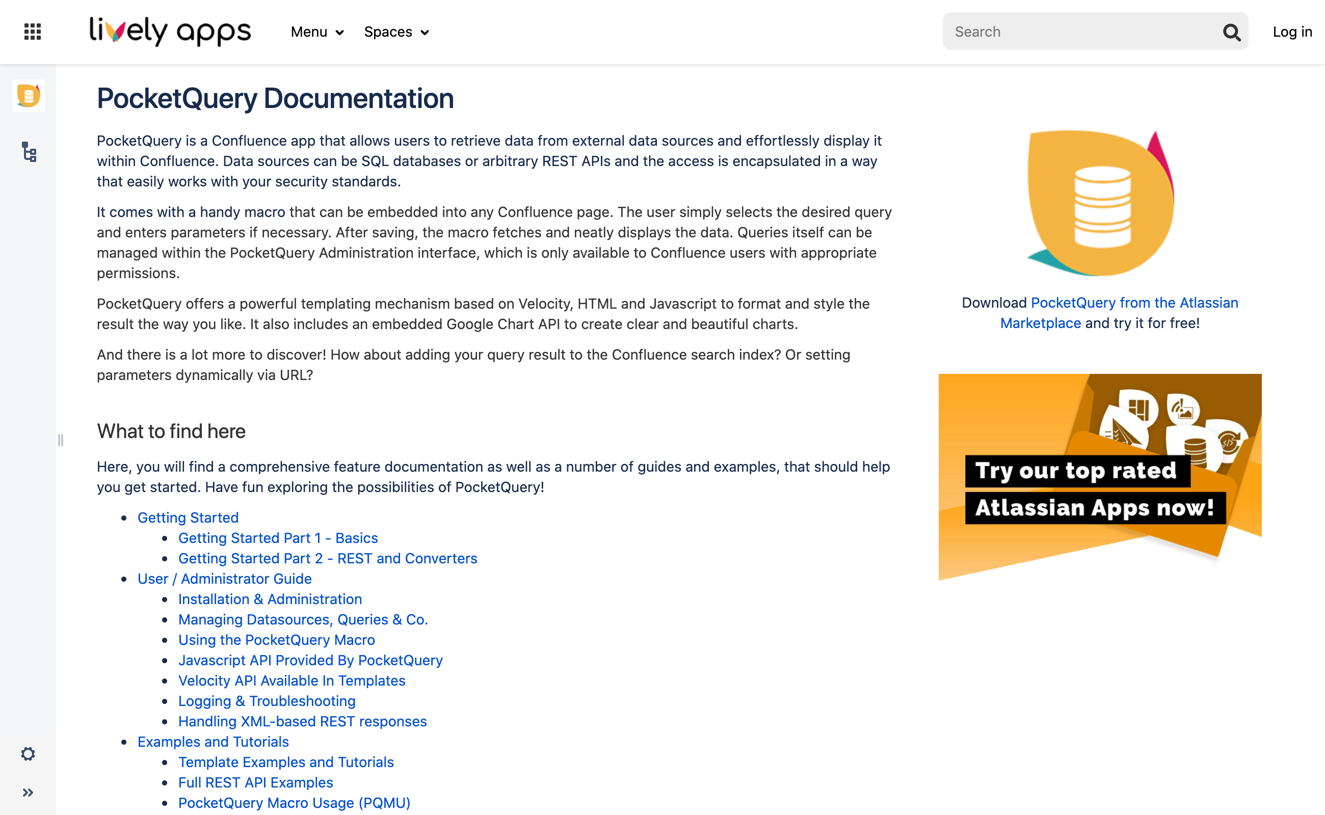
Having a public Confluence space as our documentation in the Cloud would have forced us to go with the vanilla Confluence styling and make all of the hidden elements visible again – and to be frank we just couldn’t stand for this! Since Confluence Cloud simply doesn’t offer the same customization capabilities as its On-Premise counterpart, we bit the bullet and stayed chained to old Confluence Server (but just for our documentation of course). This of course was a huge pain for us as we now had everything in the Cloud except for our documentation, so we actively kept searching for a solution.
Fortunately, our friends from K15t soon offered us to try out their app Scroll Viewport for Confluence which turned out to be exactly what we needed – and a lot more than that! This is how it works: in Scroll Viewport, you create a space for each section of your documentation. In our case this meant that we needed one space per app which we could then select as Content Sources in the Scroll Viewport administration screen. This was exactly the way our old documentation was already set up on Confluence Server, so migrating this to the Cloud was pretty easy once again.
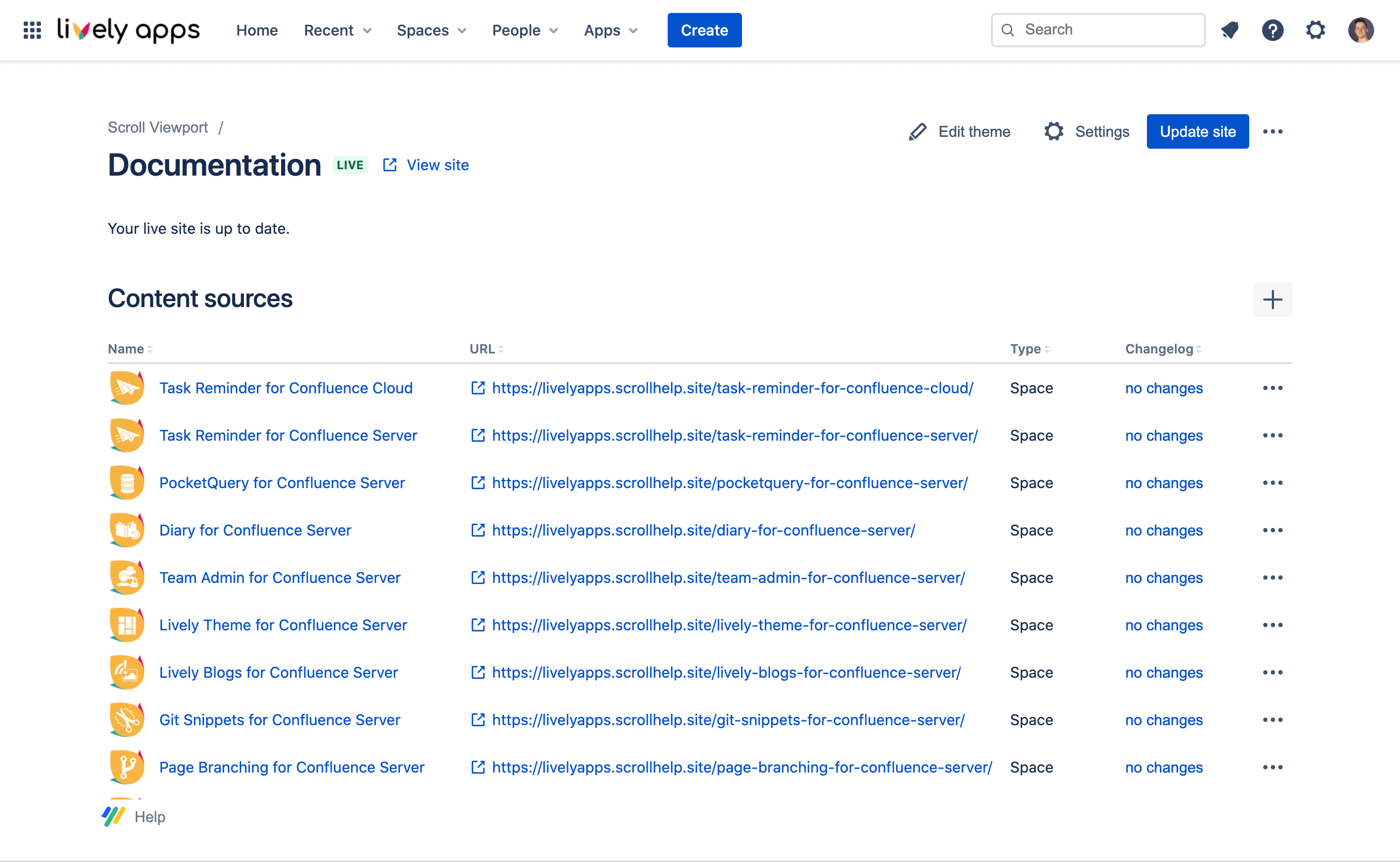
Via the Theme editor, you can then decide how your Content Sources should be displayed. The app provides you with comprehensive styling and layout options for both your landing page (portal) and documentation articles. We decided to go with the Article layout and a bright color scheme as this reminded us of our old documentation and looked the cleanest to us.
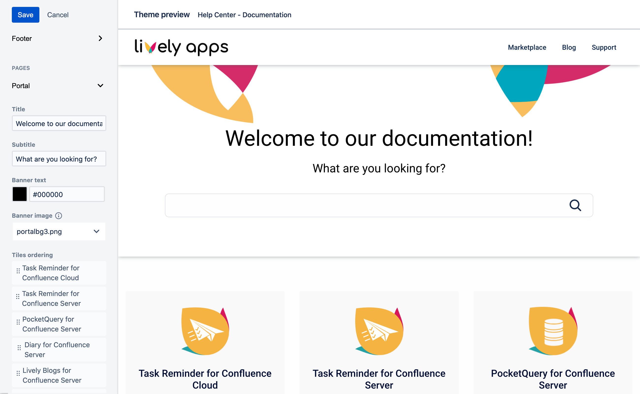
Once you have chosen a style you like, you simply hit the “Generate Site” button and Scroll Viewport will compile your Confluence pages into a great looking website. It will give you the ability to preview your site and if you like it you can publish it on a scrollhelp.site domain with one single click. Alternatively, if you want to go with your own domain, that’s only a few clicks more and you’re live! (check out ours at https://help.livelyapps.com)
But here’s the best part: it really just works! Formatted text, images, page inclusions, macros… Scroll Viewport handles it all and displays it beautifully on your rendered site. You can also exclude certain pages or place them more prominently on your landing page by applying certain labels to them. And the aforementioned preview mechanism allows you to prepare new versions of your documentation before you go live. This is especially great if you do app releases like us and want to update several parts of your documentation at once.
Quite obviously, we love what we were able to build with Scroll Viewport and without it we’d still be sitting on Confluence Server with our documentation today. So thanks again to K15t for creating this awesome app and helping us to fully and truly move to the Cloud!!! 😍🥳🍾
Want to give Scroll Viewport a try as well?
You can find it on the Atlassian Marketplace here.


.png)
.png)
.png)

.png)
